Screen and Viewport Properties for Responsive Design
Learn how screen, viewport, and device-pixel-ratio properties support responsive layouts, testing, and privacy-aware product decisions.
Want the structured docs for Fingerprint?
This article lives in the editorial library. For step-by-step setup, reference material, and ongoing updates, jump into the docs section.
Responsive design should respond to the space available for a page, not guess who is using it. The viewport is the area in which the document is laid out; screen properties describe a display context outside that page. devicePixelRatio relates CSS pixels to physical pixels and can change with zoom or display settings. These values help an application choose a readable layout, but they are not a reliable device identity.
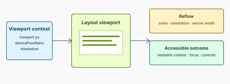
Viewport and display answer different questions
window.innerWidth and window.innerHeight describe the layout viewport in CSS pixels. The CSSOM View specification also defines screen-related objects and window geometry, but a page should use each value for its intended purpose. Layout decisions normally belong to CSS media queries and the viewport, while a screen value can describe a larger display area that is partly hidden by browser chrome or other windows.
The visual viewport can differ from the layout viewport when a page is zoomed or when an on-screen keyboard changes the visible area. Treat those changes as normal layout events. Do not assume that a wide screen means a wide usable viewport, or that two equal viewports came from the same display.
For related display configuration, see the screen and window guide and the device pixel ratio policy. Those pages describe browser configuration boundaries; this guide focuses on user-facing layout.
Use properties to build resilient layouts
Start with content and controls that work in a narrow viewport, then add columns, larger media, or denser navigation when the available space supports them. CSS container and media queries express these choices without requiring a list of device models. Flexible grids, intrinsic sizing, responsive images, and text that can wrap are generally more durable than fixed coordinates.
JavaScript can observe a specific application need, such as resizing a chart or repositioning a dialog, with ResizeObserver or a media-query match. Keep the response tied to the visible outcome. A layout that needs a 640-pixel content region does not need to retain the user's full screen dimensions. The device emulation guide can help test representative viewport sizes without turning those sizes into identity claims.
If a value is unavailable, delayed, or changes after zoom, preserve the core task. A menu can become a button, a table can scroll, and an image can use a smaller source. Avoid a branch that leaves an empty region or blocks reading simply because a preferred measurement was not available.
Account for zoom and orientation
devicePixelRatio is not a permanent device label. MDN documents that it can change when page zoom or display configuration changes. Browser zoom can therefore alter the relationship between CSS and physical pixels while the user remains on the same computer. Use CSS pixels for layout and test zoom levels that your product promises to support.
Orientation changes can resize the viewport and may change the visual viewport independently of the display's native shape. Reflow headings, controls, and media rather than assuming that portrait and landscape have fixed dimensions. Preserve focus and form state while the layout moves, and do not rely on an orientation-specific gesture as the only way to complete an action.
When a screenshot or visual regression test uses a scale factor, record it beside the viewport and browser version. A different scale can change bitmap dimensions without changing the intended CSS layout. Compare user-visible outcomes and keep separate baselines when the test deliberately targets different display settings.
Test accessible outcomes, not device categories
Test a matrix of viewport widths, zoom levels, orientation changes, keyboard input, and reduced-motion preferences. At each point, verify readable text, visible focus, usable hit targets, sufficient contrast, and an order that remains understandable. Test with real content lengths as well as placeholder text; localization and user text can expose wrapping failures that a fixed sample hides.
Keep essential actions in semantic HTML where possible. A canvas or visual enhancement can adapt to the viewport, but navigation, status, labels, and recovery controls should remain available to assistive technology. If space is too small for the preferred presentation, provide an equivalent list, table, or simplified control rather than a message that only describes the missing screen size.
Screen and viewport values can contribute to a browser fingerprint when collected broadly, but responsive layout does not require that collection. Ask only for the measurement needed for the current presentation, keep it in memory when persistence is unnecessary, and explain any storage or transfer. Do not classify a person or device from a particular width, ratio, or orientation.
Choose breakpoints from content needs
A breakpoint is a design decision about when a component can no longer present its content comfortably. It is not a label for a phone, tablet, laptop, or operating system. Begin by placing the component at its smallest useful width. When a heading wraps awkwardly, a row becomes too crowded, or a control loses a clear label, introduce a layout change that fixes that problem. This approach produces breakpoints that remain useful when new devices and window sizes appear.
Prefer a small set of meaningful states over a long table of exact widths. A navigation region might have an expanded state, a compact state, and a menu state. A data table might have a full-column state and a prioritized-column state. Define what remains visible and operable in each state, then test the transitions between them. The transition itself matters because a user can resize a window, rotate a device, open a keyboard, or change zoom while a task is in progress.
Use fluid CSS before adding a breakpoint. min(), max(), clamp(), flexible tracks, and intrinsic sizing can let a component use the available space without a sudden jump. A fluid rule should still have a readable minimum and a manageable maximum. Do not allow a paragraph to become an extremely long line merely because the screen is wide; constrain reading measure and let surrounding space remain available for navigation or supporting information.
Responsive images should preserve meaning as well as fit. Use srcset and sizes when different resources represent the same content at different resolutions, and provide an informative alternative when an image is unavailable. The selected resource is an implementation detail, not evidence that a particular device model is present. Avoid changing the wording or task solely because a higher-density source was selected.
Handle safe areas and transient UI
Modern displays can include rounded corners, cutouts, browser toolbars, and areas covered temporarily by an on-screen keyboard. CSS environment variables such as env(safe-area-inset-top) can add space where the platform requires it. Treat these insets as a rendering constraint. They do not identify the device, and they should not be copied into analytics as a hardware category.
Transient UI can shrink the visible region without changing the document's intended structure. A keyboard may cover the lower part of a form, a browser toolbar may expand, or a split-screen window may become narrower. Keep the focused field visible, scroll it into view when appropriate, and avoid placing a primary action at a fixed coordinate that can be covered. When the transient UI closes, do not reset the user's entered values or focus unexpectedly.
Dialogs and popovers need a viewport-aware placement strategy. Anchor them to the control that opened them, keep them within the visible region, and provide a close action that is reachable by keyboard and assistive technology. A dialog that technically fits the layout viewport may still be clipped in the visual viewport. Recalculate placement when the visual viewport changes, but do not recreate the component in a way that loses focus or announces duplicate content.
Make measurement and privacy decisions explicit
Before reading a browser property, write down the user-facing decision it supports. “Choose a two-column layout when the content region is wide enough” is a bounded purpose. “Collect every display property for later comparison” is a different data practice and needs a separate privacy review. The narrow purpose also makes testing easier because the expected result is observable.
Do not use screen values as a proxy for identity, income, location, age, or accessibility need. A shared computer, a resized window, browser zoom, remote desktop, operating-system scaling, and assistive technology can all produce combinations that do not match a device catalogue. Even a stable value can be shared by many people. A responsive component should work from the current layout condition rather than a classification inferred from it.
If a service sends measurements to a server, document the fields, purpose, retention, and access. Ask for consent when the transfer is optional or unrelated to the requested feature. Where server-side rendering needs an initial guess, keep the guess coarse and reconcile it with the actual viewport after hydration without exposing a detailed profile. A mismatch should trigger a layout update, not a user-facing identity decision.
Prefer local computation for layout. CSS media queries, container queries, and matchMedia can choose a presentation without sending dimensions anywhere. When telemetry is genuinely needed to improve a component, aggregate outcome data such as “compact navigation was opened” rather than retaining raw width, height, ratio, and screen coordinates together. Set a short retention period and remove fields that do not change the product decision.
Document a practical test matrix
Keep a small matrix that names the content state, viewport range, zoom level, orientation, input method, and expected accessible outcome. Include at least one narrow width where navigation changes, one wide width where the full layout is comfortable, and one intermediate width where wrapping is most likely to fail. Add a zoomed case and a case with the virtual keyboard if the product includes forms or editing.
For each case, record what a person can do, not only the measured dimensions. A passing result might say that a user can open navigation, identify the current page, move focus to the next field, submit the form, and recover from a validation message. This language stays useful when browser geometry differs across platforms. It also catches regressions that a screenshot comparison cannot see, such as a clipped focus ring or an inaccessible collapsed control.
Automated checks can assert structural facts, such as the presence of a landmark, a label, a focusable close button, or a table header. Manual checks are still needed for reading order, zoomed reflow, touch target spacing, and whether status messages make sense when content moves. Run the matrix after changing typography, navigation, dialog placement, or image selection, because each can alter the effective space even when the outer page width is unchanged.
When a test records a viewport or scale factor, treat that record as test configuration. Do not publish it as a characteristic of the person who ran the test. Keep the browser version and relevant preference beside it so a future failure can distinguish a product regression from a changed environment. This separation lets teams improve layout quality without building a database of display identities.
Summary
Use the layout viewport to decide how content fits, use screen context only where a documented presentation decision needs it, and treat device-pixel ratio as a value that can change. Build fluid components with content-led breakpoints, preserve semantic controls through every state, and test zoom, orientation, keyboard, and assistive technology paths. Collect no more display information than the user-facing task requires, and never turn a layout measurement into a classification of a person or device.
The CSSOM View model is useful because it separates geometry concepts that applications often conflate. A layout viewport provides the coordinate space for document layout, while the visual viewport describes the portion currently visible to the user. Window and screen objects expose related geometry, but neither object is a complete description of the physical device. Browser chrome, window management, zoom, and operating-system scaling can all change the relationship between these values.
The distinction also matters for server-rendered pages. A server may render a conservative first state, but the client should confirm the actual layout conditions after the document is available. Reconciliation should update presentation without discarding entered data, focus, or navigation state. A coarse rendering hint can improve startup performance; it should not become a stored profile of a person or an assumption that later overrides the viewport.
The device-pixel-ratio documentation describes a ratio between physical and CSS pixels and notes that the value can change as a page is zoomed. That means a test or component should not treat one ratio as a permanent property of a browser. Keep scale-dependent rendering decisions local to the current view, and rerun the relevant layout calculation after a supported zoom or display change.
Responsive images and CSS resolution queries can select different resources at different scales. The selection should preserve the same meaning, labels, and interaction. A higher-density image is not evidence that the user owns a particular model, and a lower-density source is not a reason to remove an important control. Provide equivalent text and controls independently of the selected resource.
The W3C responsive design guidance emphasizes flexible layouts, media queries, and content that can adapt to different viewport sizes. Those techniques are compatible with privacy minimization because the decision can stay in CSS or in a short-lived client-side match. A service does not need a history of raw dimensions to know that a navigation component is currently compact.
When a measurement is sent to a service, the data flow becomes part of the feature design. Document why the value leaves the browser, how long it is retained, who can access it, and whether the feature works without transfer. An explicit choice is appropriate when the transfer is optional or unrelated to the requested layout. Do not hide a collection of display values inside an unrelated analytics event.
Accessibility testing should include browser zoom and text enlargement, not only a smaller window. Users can enlarge text while keeping the viewport width unchanged, causing labels, buttons, and table cells to wrap differently. Verify that focus indicators remain visible, controls remain reachable, and no information depends on a fixed pixel height. CSS pixels express layout space, not a guarantee about the size a person perceives.
Orientation is another state transition rather than a device category. A rotation can change available width, keyboard presence, and the visual viewport in quick succession. Debounce expensive work where appropriate, but do not delay essential status or hide controls during the transition. Preserve scroll position when it remains meaningful and announce important changes through the normal accessible status pattern.
The same principles apply to embedded documents and components. A component should respond to its container when its design depends on local space, rather than reading a global screen value. This avoids incorrect behavior in split-screen windows, side panels, iframes, and resizable application shells. Container-based decisions are easier to reuse and reduce the temptation to maintain device-specific exceptions.
Visual regression captures are evidence about a chosen test configuration, not about a user's identity. Record viewport, zoom, orientation, browser version, and relevant preferences beside a baseline. If one of those inputs intentionally changes, create a new baseline with a clear reason. Do not overwrite a reference merely because a runner has a different monitor or window manager.
Finally, review the property list whenever a feature changes. Remove values that no longer drive a user-facing decision, and keep a short explanation for every value that remains. This routine limits accidental data collection while making responsive behavior easier to debug. A page that remains useful across widths, zoom levels, and orientations demonstrates the product outcome more clearly than a detailed inventory of the environment.
Sources
Related Articles
Take BotBrowser from research to production
The guides cover the model first, then move into cross-platform validation, isolated contexts, and scale-ready browser deployment.