Screen Orientation API and Responsive Experiences
Use orientation changes as a responsive layout state while preserving accessibility, user choice, and privacy.
Want the structured docs for Fingerprint?
This article lives in the editorial library. For step-by-step setup, reference material, and ongoing updates, jump into the docs section.
The Screen Orientation API lets a web application observe the current orientation and, in supported contexts, request a preferred orientation. Responsive design should treat orientation as one changing layout condition, not as a device label. A phone can be held in either direction, a laptop can be rotated or resized, and a split-screen window can be narrower than the screen. Build from the space available to the page, preserve the user's task, and use orientation information only when it changes a visible product decision.
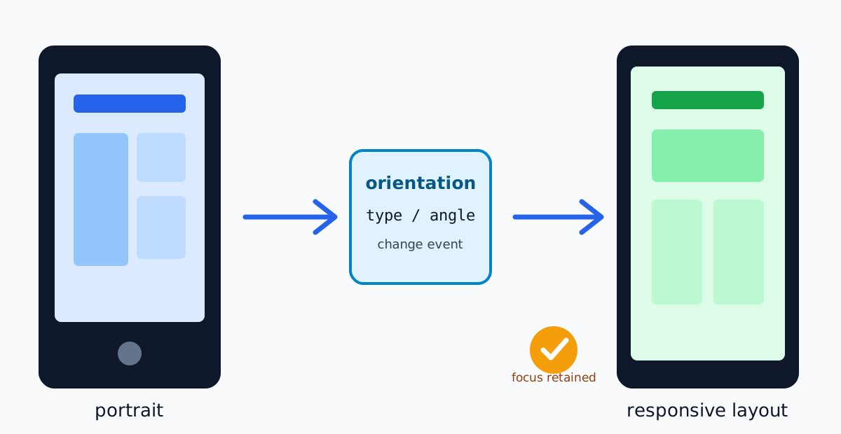
The W3C Screen Orientation specification defines the orientation object, its type and angle, change events, and the conditions for locking orientation. The MDN Screen Orientation API reference documents the browser-facing surface and compatibility notes. These sources describe what a browser may expose; they do not require a product to lock a screen or to collect orientation history.
For related geometry decisions, see the screen and viewport guide and the pointer accessibility guide.
Treat orientation as layout state
screen.orientation.type describes a current orientation category such as portrait-primary or landscape-primary, while screen.orientation.angle reports an angle relative to the natural orientation. Both values can change during a rotation, and the exact sequence depends on the browser and operating system. A layout should wait for the resulting viewport to settle rather than assuming that one event is the whole transition.
Most layout decisions belong in CSS. Media queries such as (orientation: portrait) can switch a grid, while container queries let a component respond to its own width inside a split view or embedded document. JavaScript can use matchMedia or the orientation object when a specific behavior, such as resizing a canvas or recalculating a game board, cannot be expressed in CSS. Keep the branch tied to the visible outcome, not to a device catalogue.
Orientation does not tell an application whether a person is using a phone, tablet, desktop, or remote session. Browser chrome, window management, zoom, accessibility settings, and virtual keyboards can all change the effective space. A portrait viewport on a desktop window is still a valid state. Do not infer identity, location, age, or capability from the orientation value.
Preserve the task through rotation
Rotation is a state transition while a person is reading, editing, or completing a form. Preserve entered data, scroll position where it remains meaningful, selected tabs, and the focused control. Do not recreate the page or force a navigation merely because the orientation changed. If a component must be rebuilt, restore focus deliberately and announce only a meaningful status change.
Use flexible tracks, wrapping labels, responsive images, and content-led breakpoints. A two-column form can become one column when the content region is too narrow; a wide table can expose priority columns and a keyboard-accessible overflow view. A control that is hidden in portrait must have an equivalent action in the visible layout. Never make a gesture that depends on a particular orientation the only route to a critical action.
Transient UI makes the visual viewport different from the layout viewport. A virtual keyboard, browser toolbar, or split-screen divider can cover content after a rotation. Keep the active field visible, avoid fixed bottom actions that are obscured, and recalculate dialog placement when the visual viewport changes. The CSSOM View specification provides the geometry concepts; the application remains responsible for an operable result.
Request orientation only for a real need
screen.orientation.lock() is a request, not a universal command. The specification and browser documentation describe restrictions based on document visibility, browsing context, user activation, fullscreen, and platform policy. A call can reject, and a browser can decline to honor a requested lock. The page must remain usable when the request is unavailable.
Locking can be appropriate for a focused experience such as a game board, a camera preview, or a presentation where the content genuinely depends on a stable aspect. Explain the effect before requesting it, provide an obvious way to leave the mode, and release the lock when the task ends. Do not lock orientation merely to make a desktop layout easier to implement, to classify a visitor, or to prevent a responsive design from adapting.
An explicit user action is the right place to begin a mode that changes the whole display. A page opened from a link should not unexpectedly rotate or trap a person in a mode they did not choose. If the browser rejects the request, show the ordinary responsive layout and keep the task available. A failure is a compatibility outcome, not evidence about the device or the user.
Use events without race conditions
The orientation object exposes a change event. Event handlers should read the current state, update only the affected component, and tolerate repeated notifications. Pair the event with a resize or visual-viewport observation when the component depends on actual available space; orientation and viewport changes are related but not interchangeable.
Avoid expensive synchronous work in the event handler. Schedule a bounded layout update, cancel obsolete work, and keep input responsive during a rotation. If media, a map, or a canvas needs a new size, preserve its semantic content while changing its rendering dimensions. A failed redraw should leave a usable alternative rather than a blank region.
Feature detection should guard optional behavior. Check that screen.orientation and the method you intend to call exist, and catch a rejected promise from lock(). The fallback can use CSS media queries and ordinary resize handling. Do not create a second implementation that silently collects orientation, angle, viewport, and screen values when the API is absent.
Keep accessibility and user control visible
Responsive reflow must preserve semantic headings, landmarks, labels, and a logical reading order. Test keyboard navigation after changing orientation, including focus rings near the edge of the visual viewport. A screen reader should receive an update only when the application has a useful status, such as “controls moved above the preview”; it does not need a raw angle announcement for every rotation.
Respect zoom, text enlargement, reduced motion, and high-contrast or forced-color modes alongside orientation. A layout that fits at the default scale can fail when text is enlarged in landscape or when a user rotates while a keyboard is open. Keep hit targets, contrast, and error messages usable in each state. The WCAG 2.2 guidance is a reference for these outcomes; orientation alone does not determine conformance.
Provide a visible exit from an orientation-dependent mode. A “return to responsive view” action should be keyboard reachable and should not erase work. Explain when the browser or operating system controls the rotation and when the application has only requested a preference. Do not imply that a denied lock means the user configured the browser incorrectly.
Test behavior, not device categories
Create a matrix around user outcomes: portrait and landscape, narrow and wide windows, zoomed text, virtual-keyboard presence, keyboard and touch input, reduced motion, and a browser that does not implement the API. For each case, verify that a person can read the content, reach the primary action, recover from an error, and leave any locked mode. Include an intermediate width where wrapping is likely to fail.
Record the browser version, viewport, orientation, and relevant preferences as test configuration. A screenshot or automated run is evidence about that configuration, not a stable characteristic of the person who ran it. Keep test fixtures synthetic and do not send raw orientation histories to an analytics service. If telemetry is needed, prefer an aggregate outcome such as “compact navigation opened” over a bundle of angle, dimensions, and timing values.
Run a compatibility check when changing browser support or a lock request. Confirm the public specification and current MDN notes, then test the fallback path on a browser where the method is unavailable or rejected. Keep the feature optional and document which user action starts it. User-facing support guidance should describe the visible behavior and support range, not promise identical event ordering on every platform.
Build a privacy-aware responsive contract
Before reading an orientation property, write down the user-facing decision it supports: for example, “place the preview beside the controls when the component is wide enough.” Prefer CSS and local matchMedia decisions so the value never leaves the browser. If a service genuinely needs an outcome for product improvement, document the purpose, retention, access, and user choice, and remove raw angle and dimension fields that do not affect the decision.
Orientation can contribute to a browser fingerprint when combined with many other values, but responsive layout does not require building that profile. Do not use a portrait or landscape result as an account, fraud, or eligibility signal. A shared computer, a rotated monitor, an emulator, and a resized window can produce the same value for different people. Treat unavailable or coarse values as normal and preserve the baseline experience.
Keep the contract explicit across locales and products: the browser may expose an orientation, the application may adapt its presentation, and a lock may be unavailable or rejected. Those are different statements. Do not turn a conditional capability into a guarantee in documentation, UI copy, or a translated version. When the user chooses a mode, record the choice as a product preference, not as inferred hardware data.
The visual viewport deserves a separate check from orientation. A rotation can change the layout viewport, then a browser toolbar or keyboard can reduce the visible area a moment later. Measure the space needed by the focused control and move it into view without changing the document's meaning. A fixed footer that fits after the rotation may still be hidden when the keyboard opens. Treat safe-area insets and transient overlays as rendering constraints, not as durable properties of a device. This also works for foldable displays, desktop split views, remote sessions, and browser windows resized without physical rotation.
Teams can make this contract reviewable by naming an expected outcome for each responsive state. In a compact navigation state, a keyboard user should open the menu, identify the current page, and close it without losing focus. In a media state, captions, playback, and the primary action should remain available after the preview changes size. These outcomes are more durable than a table of phone models or exact angles, and they describe failures without collecting a detailed environment profile. When a browser changes an implementation detail, rerun the outcome matrix and revise public support guidance only when visible behavior changes.
The same rule applies to analytics and experimentation. If a team compares two navigation presentations, record which presentation was shown and whether the requested task completed; do not retain the raw orientation angle, full screen dimensions, and timing as a surrogate user profile. Keep an experiment assignment independent from a lock request so a person can decline the mode without losing access to the baseline interface.
Review the contract when adding a new orientation-dependent feature. Remove a property that no longer drives a visible decision, check that every translated explanation preserves conditional wording, and verify that the fallback remains reachable with keyboard and assistive technology. This small review keeps responsive behavior understandable as browsers, form factors, and window managers change.
An accessible fallback is part of the feature, not an error screen. Give it the same heading, labels, and task data as the preferred mode, and make the transition understandable when a lock is denied. A person should be able to continue in portrait after asking for landscape, or continue in a resized window after a fullscreen request ends. This is also a useful acceptance criterion for embedded tools: the component should expose its controls even when its container cannot provide the expected aspect ratio.
The fallback should keep error recovery, status messaging, and the next action visible, so a change in orientation never turns a temporary compatibility result into a dead end for the reader. It should also preserve the current draft and announce a meaningful update without moving focus unexpectedly, allowing the person to continue even when the preferred presentation cannot be used on the current browser or platform or under current accessibility settings.
Keep orientation choices reversible. If a product remembers that a user selected a presentation mode, store that explicit preference separately from browser observations and provide a reset action. Do not silently convert a remembered choice into a claim about the current device. On the next visit, re-evaluate the available space and let the user change the presentation without losing their place.
Practical checklist
- Use CSS or container queries for ordinary reflow; use JavaScript only for a bounded behavior.
- Preserve form values, focus, reading order, and recovery controls during rotation.
- Explain and request a lock only after a user action, and handle rejection with a responsive fallback.
- Test zoom, keyboards, assistive technology, and narrow intermediate widths in both orientations.
- Keep orientation measurements local unless a documented, optional product decision requires transfer.
Plan transitions and recovery
An orientation change can coincide with a route transition, a pending network request, or a validation error. Keep those states independent, store the draft in an explicitly chosen local session boundary, and let the layout change around it without submitting twice. Media-heavy screens should separate semantic content from presentation size: a player can move controls into a menu while retaining captions, playback position, and keyboard commands, and a drawing surface can resize without discarding its document. Deep links and browser history should remain stable, so rotating a help panel or editor restores the same task rather than encoding a transient angle or redirecting after a failed lock. Server-rendered interfaces can start with a conservative layout, but hydration must not replace entered text or move focus; CSS should provide the first presentation and the client update should be idempotent. Embedded components need their own boundary because an iframe, side panel, or resizable editor may have a landscape-shaped container while the top-level screen is portrait; container queries and local resize observation prevent unrelated surfaces from being coupled. Rotation animation should be short, interruptible, optional, and compatible with reduced motion, while essential controls remain available if intermediate sizes arrive. Document support in user-facing terms: explain that the experience adapts to available space and that a browser may decline a lock, without promising identical angles or event order across operating systems. When investigating a bug, record the visible outcome, route, browser release, viewport, orientation, and relevant preference in a small redacted packet; a full screen inventory or persistent identifier is unnecessary, and temporary reproduction data should be removed afterward.
Sources
Related Articles
Take BotBrowser from research to production
The guides cover the model first, then move into cross-platform validation, isolated contexts, and scale-ready browser deployment.