Media Query Preferences: Respect User Choices in Web Interfaces
Use reduced-motion, contrast, forced-colors, and color-scheme preferences as accessible defaults while keeping clear, user-visible controls.
Want the structured docs for Platform?
This article lives in the editorial library. For step-by-step setup, reference material, and ongoing updates, jump into the docs section.
CSS media features let a page adapt to accessibility and appearance preferences or default states exposed by an operating system, browser, or other user agent. Queries such as prefers-reduced-motion, prefers-contrast, forced-colors, and prefers-color-scheme help a site begin with a presentation that fits those states. They should be treated as inputs to a usable design, not as a substitute for readable defaults, semantic controls, or an explicit way to choose an appearance.
The practical rule is simple: honor the preference, preserve the task, and make any site-level override easy to find and reverse. A motion-sensitive user should still be able to understand a state change; a person using a system color palette should still be able to distinguish controls; and someone who prefers a dark interface should not have to accept a site-wide dark theme with poor contrast. The pointer interaction guide covers another part of adapting interfaces to people, while browser interaction validation and privacy by design for browser workflows describe broader testing and choice principles.
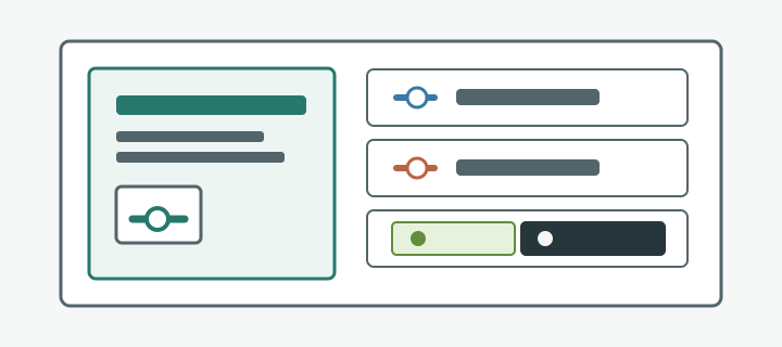
Preferences are design inputs, not a complete accessibility solution
Media queries are conditional rules in CSS. A query tests a media feature, such as the user's preferred color scheme or whether the browser is applying a forced color palette, and lets a stylesheet select corresponding declarations. This is the same general mechanism that lets layouts respond to viewport width, but the condition represents a presentation preference rather than a physical screen dimension. The browser evaluates the query and applies matching rules as the relevant environment changes.
These features report a limited set of values defined by the web platform. They do not explain why a person selected a setting, what assistive technology they use, or what presentation will work best for them in every context. An application should not try to infer those private details. It can respond to the preference that the browser exposes and provide a coherent interface without assigning a label or capability to the person. A preference is a useful design signal, not a user profile.
The distinction matters because a media query cannot repair every accessibility problem. A reduced-motion rule cannot add a missing label to a control. A dark color scheme does not by itself guarantee readable text. A forced-color adaptation cannot replace meaningful HTML semantics. Every presentation still needs adequate contrast, visible focus, understandable status, and controls that remain operable with the interaction methods the product supports.
Use media queries as progressive adaptation. Start with a complete default experience, then change only the parts that should respond to the preference. Keep content, hierarchy, and task completion consistent across themes. If an animation communicates progress, for example, reducing motion should not make progress disappear; a static indicator or concise status can carry the same information. If a color identifies an error, the message and iconography should also make the error understandable.
Prefer CSS for visual changes because the browser can re-evaluate styles without waiting for application code. JavaScript is appropriate when a preference must affect application behavior that CSS cannot control, such as whether to start an optional animation sequence. Keep that behavior bounded and make it possible to stop or change it. Do not use JavaScript to reconstruct a preference that CSS can handle directly, and do not persist a browser-derived choice as though it were a deliberate selection in the site's own settings.
Reduced motion should preserve meaning and control
The prefers-reduced-motion media feature can match when a user has requested that the interface reduce non-essential motion. A stylesheet can use @media (prefers-reduced-motion: reduce) to remove or shorten transitions, parallax effects, animated scrolling, autoplaying movement, and other motion that is not needed to complete the task. A corresponding no-preference value indicates that the user agent has no reduced-motion request to apply; it is not permission to make every interaction animated or to assume that motion is comfortable for every person.
Begin by identifying which movement is decorative and which communicates necessary information. A bouncing card used only to attract attention can usually become still. A loading sequence may need a stable progress indicator or a text status instead of a moving loop. A chart transition can update directly to the new value while keeping labels and the prior context visible. A collapsible panel can open without a long sliding animation, while its expanded state remains programmatically available. The goal is not to hide change. It is to communicate change without unnecessary movement.
Applying the rule globally may be a useful baseline, but components should not rely on a single global duration override as their only accommodation. Motion can come from CSS transitions, keyframes, JavaScript animation libraries, embedded media, or content that plays automatically. Review the full experience and use component-level rules where needed. A rule that sets every animation duration to nearly zero can still leave distracting frame updates, flashing, or movement caused by scripts. It can also accidentally remove timing that helps users perceive an interaction. Test the outcome, not only whether a selector matches.
Some motion is directly requested by the user, such as a play button that starts a video or a chart animation the person explicitly opens. The reduced-motion preference should not silently make an essential control unavailable. Instead, consider an alternate static presentation, a paused initial state, or an explicit play action with a visible stop or pause control. WCAG 2.2 Success Criterion 2.2.2 addresses moving, blinking, or scrolling content that starts automatically, lasts more than five seconds, and appears alongside other content: provide a way to pause, stop, or hide it unless the movement is essential.
If the product adds its own motion setting, make the choices understandable, such as “Use reduced motion” or “Allow interface animations.” Explain the practical effect near the setting rather than exposing implementation jargon. Do not force a person to open a system settings panel just to stop an optional effect inside the site. Conversely, do not make a site setting silently override the operating-system request. A conservative precedence is to honor system reduction by default and let an explicit site choice affect only the site's optional behavior, with an easy way to return to the system setting.
Contrast preferences need clear visual alternatives
The prefers-contrast feature allows styles to respond to a user agent's indication that the user prefers more contrast, less contrast, or a particular contrast treatment. The exact values supported by a browser depend on the platform and implementation; authors should check current compatibility before relying on a specific value. The important design responsibility is broader than targeting one query: ordinary text and controls need to remain perceivable under the conditions the page supports, and information must not depend only on a subtle shade difference.
For a more preference, useful adaptations can include stronger text-to-background separation, clearer borders around controls, more visible focus indicators, and increased distinction between adjacent states. A selected tab should not be represented only by a tiny hue shift. Pair the color change with an underline, shape, weight, or other visible state. Disabled controls should remain understandable without becoming indistinguishable from surrounding text. Error and success messages should use a label or icon alongside color so the meaning remains available to people with different forms of color perception.
A less preference can be relevant to people who find intense contrast uncomfortable. It does not mean that essential text should become faint or that controls should disappear into their background. Define a modest alternative palette that retains readable content, visible boundaries, and focus. Check small text, thin strokes, placeholder text, selected states, and hover states separately. A palette that looks balanced in a large heading can fail in a compact form or a disabled button.
The custom value, where supported, can indicate a user-set contrast preference that does not fit the simpler more or less categories. Avoid treating this value as an instruction to invent a universal “custom contrast” mode. The browser may not expose the user's chosen colors through this media feature. Keep the page legible with its own carefully tested defaults, and use user-selectable themes when the application can offer meaningful alternatives.
Do not rely on a preference query to meet baseline contrast needs. People may not know where to enable an operating-system option; their browser may not expose it; or the content may be viewed in an environment that transforms colors. Check text, essential graphical objects, focus rings, and control boundaries against the applicable accessibility criteria in the default theme and in supported preference modes. Contrast changes should not remove the brand identity or produce a second palette that has never been reviewed at real content sizes.
Forced colors calls for system colors and restraint
The forced-colors media feature indicates whether the user agent is enforcing a limited color palette. This mode is distinct from a high-contrast preference: the browser can replace author-specified colors with colors chosen by the user or system so that foregrounds and backgrounds follow a coordinated palette. A query such as @media (forced-colors: active) lets a stylesheet make targeted adjustments where the normal presentation depends on visual distinctions that the forced palette changes.
In this mode, preserve the browser's ability to apply the palette. System color keywords such as Canvas, CanvasText, LinkText, ButtonFace, and ButtonText can express relationships to the active system colors instead of hard-coding a light or dark RGB value. Prefer native controls where their semantics fit. For custom controls, ensure that borders, focus indicators, selection, and state remain perceivable after the user agent has adjusted colors. A border that was intentionally transparent in the normal theme may need to become visible so that the control's extent is still clear.
The forced-color-adjust property controls whether an element is subject to forced color adjustments. Leaving the default behavior in place is normally the right choice. Setting forced-color-adjust: none opts an element out of adjustments. Use it only for a limited element when the application itself adjusts that element's colors to support the user's color and contrast needs, and test the result in forced-colors mode. Opting out an entire page can defeat the user's palette and create unreadable combinations. A better approach is usually to preserve structure and use system colors for elements that need to adapt.
Do not assume a decorative image or background will remain available in forced-colors mode. Information conveyed through a CSS background image can be lost when backgrounds are suppressed or recolored. Use real text, accessible names, borders, or an appropriate inline graphic with a visible fallback for essential information. For icons whose meaning depends on a fill color, verify that a stroke or outline remains visible. Test keyboard focus and selected states in the actual forced-colors environment because screenshots of the ordinary theme will not reveal every override.
Forced colors is not a cue to create a separate, hard-coded black-and-white theme that competes with system settings. The operating system's palette is itself a user-visible choice, often including colors that are not simply black and white. Let the platform do its work, then add the smallest CSS adjustment needed to keep the content hierarchy and controls usable. Avoid overriding system colors globally or using forced-color-adjust: none as a quick visual-fidelity fix.
Color scheme should work with an explicit site choice
The prefers-color-scheme feature can select styles for a light or dark user preference. It allows a page to begin with a palette that fits the browser or operating-system choice, including when the person changes that preference while the page is open. A dark theme can reduce the amount of bright surface on screen in some environments, while a light theme may better fit other workflows. Neither is universally superior; both require intentional color choices and testing.
The CSS color-scheme property communicates which schemes an element or document can support. Declaring support for light and dark can help the user agent render built-in controls, form widgets, and other browser-provided surfaces in a compatible scheme. The declaration is not a promise that the whole page is accessible, and it does not replace the authored styles for site content. Coordinate the property with the palettes actually available so native inputs do not appear in one scheme while the surrounding interface appears in another.
When using a site-level theme control, distinguish “system” from an explicit “light” or “dark” choice. The initial value can follow the system preference; a deliberate choice can then take precedence until the person changes it. Make the control visible in a predictable settings area, label it in plain language, and allow an easy return to “system.” Avoid automatically switching away from a theme the person explicitly selected just because the operating-system preference changed later.
Persist a site choice only when persistence supports the feature and the user understands what is being remembered. Store the value representing the explicit choice, not a snapshot of whatever the browser preference happened to be on first load. When the value is “system,” continue to follow the current system preference. This distinction prevents a once-matching theme from becoming a stale override after the person changes their device settings. It also makes it possible to explain the behavior accurately in the interface.
Theme controls need accessible names, keyboard operation, visible focus, and a clear selected state. A segmented control can expose System, Light, and Dark choices without hiding the current value in a menu. If a compact switch is used, its label should make the resulting state clear, not merely say “toggle.” Do not use color alone to show which option is selected. Confirm that focus, errors, links, charts, and dialogs have suitable colors in every supported scheme, and ensure that custom theme changes do not cause a flash of the wrong palette before the saved choice is applied.
Preference changes should not strand an open task
Media queries are evaluated against the current environment, not just once when a page loads. CSS can respond when a person switches the operating-system theme or changes an accessibility preference while the site remains open. JavaScript code that uses matchMedia() can read whether a query currently matches and listen for a change event when application behavior must react. The MediaQueryList change notification should update the relevant behavior, then clean up its listener when the component or page no longer needs it.
Keep JavaScript response narrow. A theme update might change a chart's label colors because those colors are generated in canvas rather than CSS. A reduced-motion update might stop a nonessential animation that is controlled by a component library. In each case, update only the affected presentation or behavior. Do not reload the page, discard unsaved work, close a dialog, or reset the application just because a preference changed. CSS-only responses are generally simpler and less likely to interrupt an active task.
An explicit site choice adds a second state source, so define precedence rather than letting event order decide. A useful model is: an explicit site selection controls the site's appearance; “system” delegates to the current browser preference; and an accessibility mode such as forced colors remains respected regardless of the site's palette where the user agent applies it. For motion, a site-level animation setting can govern optional site effects, but it should not start an automatic sequence that contradicts the user's reduced-motion request. State the available choice clearly and make reset to system behavior straightforward.
Apply changes without obscuring context. If an in-progress form is open, changing the theme should leave field values, validation messages, focus, and scroll position intact. If reduced motion is enabled during an animated transition, settle the component in a stable state instead of leaving it midway between two states. If a custom palette is selected while a popover is open, ensure that the popover, backdrop, and focus ring update together. A preference change should improve the current experience, not force the user to begin again.
Some platform or browser behavior may take effect immediately and some application-specific behavior may wait for the next render. Avoid promising instantaneous updates where an asynchronous chart or embedded component cannot provide them. Give feedback when an action is delayed or requires a restart, and preserve the user's ability to cancel. Most presentation changes should not need a reload; when one truly does, explain why before the user commits the change.
Test the full experience and prevent regressions
Build a regression matrix around actual tasks, not a screenshot gallery alone. Include the default appearance, light and dark preferences, reduced motion, relevant contrast values supported by the target browsers, and forced colors on a platform where the mode is available. Test combinations where they can coexist, such as dark preference with reduced motion or a site-selected theme while forced colors is active. The exact matrix depends on the product, but every mode that the interface claims to support should have an observable outcome and a repeatable check.
For each representative workflow, verify the beginning, active state, completion, and recovery path. Open and submit a form, navigate a menu, review a chart, dismiss a dialog, and return from an error. Confirm that the current mode does not hide a focus indicator, flatten button boundaries, make selected and unselected states indistinguishable, or remove information that used to be conveyed by animation. Repeat keyboard-only paths. If the task depends on a screen reader or other assistive technology, check names, roles, values, and announcements separately; visual media-query coverage does not verify the accessibility tree.
Automated visual tests can catch missing declarations or unexpected layout changes, and unit tests can verify precedence between system and explicit site choices. They cannot show on their own that a focus ring is easy to see, that an animation is distressing, or that a palette is comfortable to use. Pair automation with manual checks using browser or operating-system accessibility settings. Record the browser, platform, preference mode, task, expected result, and observed result so a future regression can be reproduced without collecting personal settings from visitors.
Include change tests as well as initial-load tests. Start in one scheme and switch to another with a form partly completed. Enable reduced motion while a transition is running. Change contrast while a focused control is on screen. Move into or out of forced-colors mode when the platform permits it. Confirm that the interface updates without losing focus, entered data, selection, or a clear path back. These cases exercise state coordination that a screenshot taken after a fresh page load can miss.
Finally, review content that depends on color, movement, or shape. Status messages should name the outcome; charts should include labels or a data alternative; animation should not be the only way to discover completion; and icons should have an accessible name when they convey an action. A theme switch should not reduce line spacing or text size in a way that changes the intended reading order. The strongest regression check is whether a person can still complete the same task, understand its result, and recover from an error across the supported preferences.
Public sources
Related Articles
Take BotBrowser from research to production
The guides cover the model first, then move into cross-platform validation, isolated contexts, and scale-ready browser deployment.